
The pie chart is a circular statistical graphic divided into slices to provide us with a visual representation of proportions. Each slice in a pie chart represents a category's contribution to the total, and allows us to make an easy comparison of different categories. Pie charts simplify complex data sets by breaking down data sections that are easier for us to understand and interpret. This helps in conveying information quickly and efficiently.
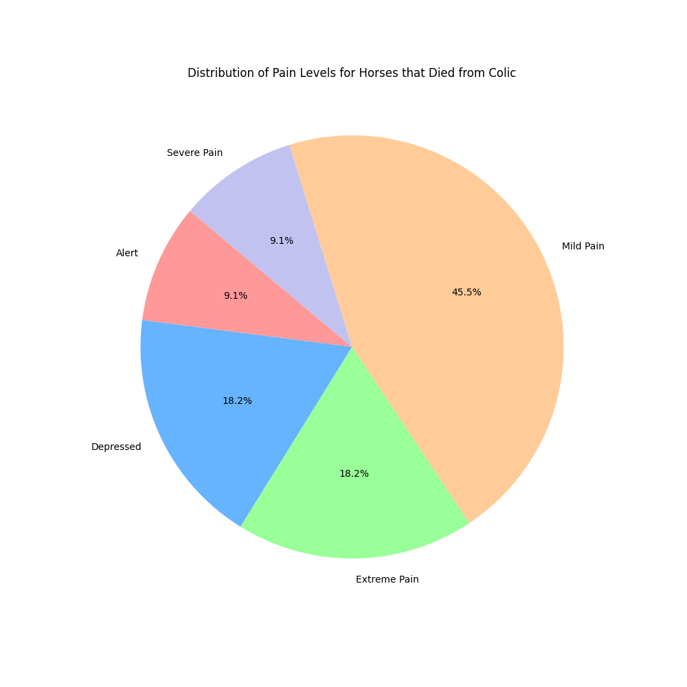
This pie chart provides a clear and intuitive visual representation of the prevalence of various pain levels in horses that died due to colic. This can help veterinarians and researchers understand which pain levels are most common among horses that did not survive, potentially aiding in better diagnosis and treatment strategies in the future.
Conclusions drawn from this visualization: