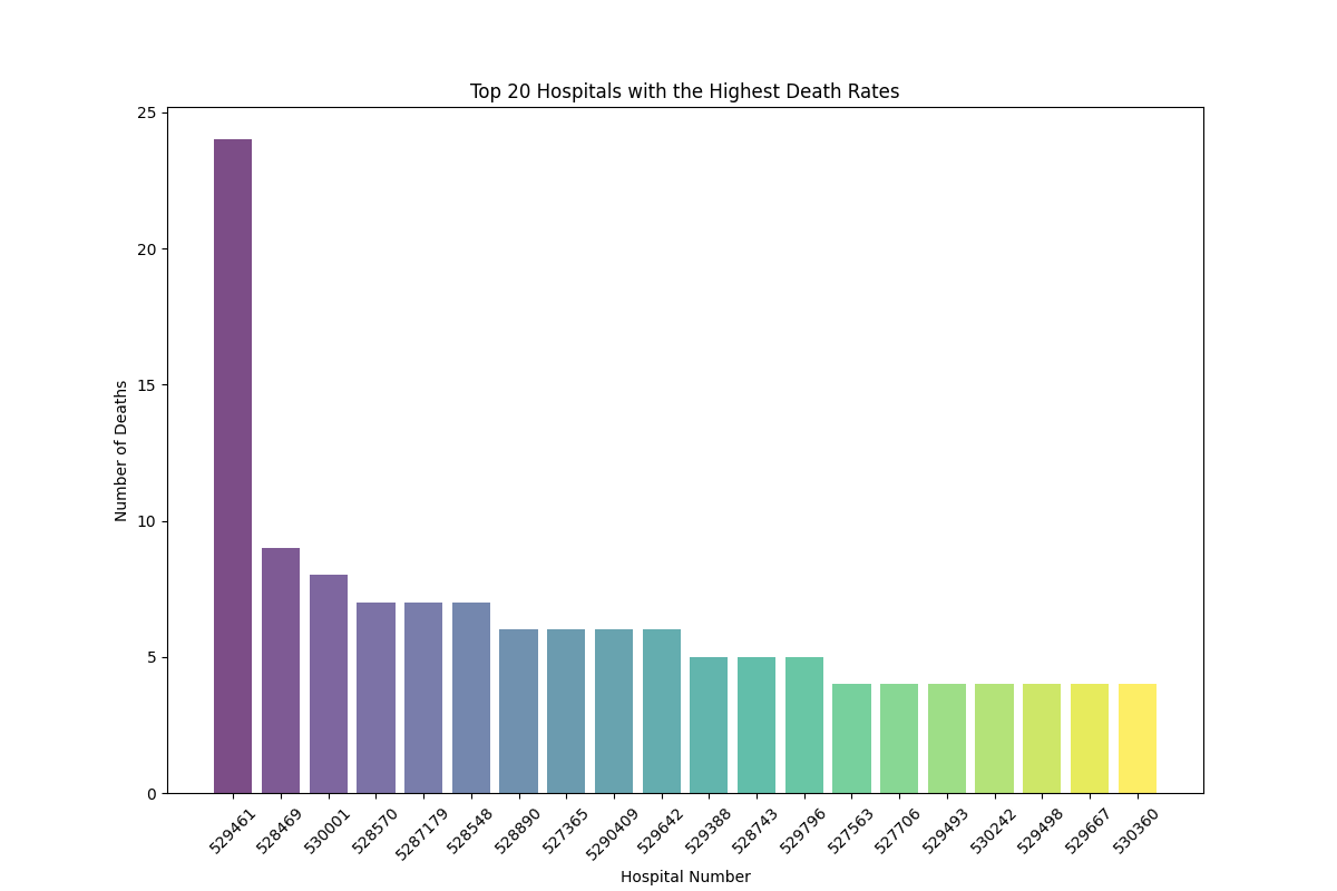

The bar graph is a visual representation that makes it easy for us to compare different categories or groups. Each bar represents a category, and the height of the bar indicates the value or frequency of that category. The purpose of a bar chart is to highlight which categories have higher or lower values.
This bar chart visually displays the top 20 hospitals and the number of deaths attributed to each hospital, sorted in descending order from left to right. Each bar represents a hospital, and the length of the bar indicates the number of deaths of horses with colic at that particular hospital. This chart identifies which hospitals have the highest death rates for horses with colic, providing valuable insights for improving veterinary care and resource allocation.
Conclusions drawn from this visualization: